TL:DR: The BLS report was a disorienting mix of good and bad news. We’re not in recession, but the data emphatically disagree about how strong the job market is.
Key data points:
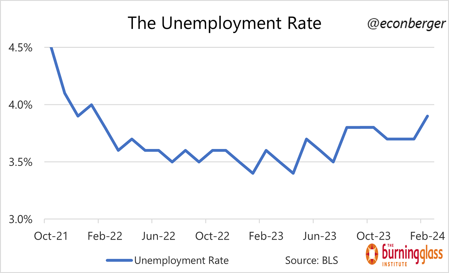
Unemployment rate: rose to 3.9%, a 2-year high (bad)
Prime working age employment population ratio: rose to 80.7% from 80.6% (good)
Nonfarm payroll employment: rose by 275K (very good)
Wage growth: 4.0% annualized over the past 3 months (a little above where the Fed wants it)
Below I discuss:
The Big Picture
The Household Survey
Reconciling the 2 Surveys
Wages & Hours
More below charts.
1. The Big Picture
Two jokey summaries of the February job numbers:
A mix of good and bad data, and to make it even more confusing the good parts had some bad sub-parts and the bad parts had good sub-parts.
The platonic jobs report for data cherrypickers.
Jokes aside, the data is loosely consistent with a “soft landing in process”: ongoing labor market expansion and relatively moderate wage growth. A lot of the anomalies we saw in the hours and wages data last month disappeared.
What’s less clear is the pace of the expansion. The two surveys in the job report - the household survey and the establishment survey - disagreed wildly about whether we’re inching forward (household survey) or chugging along briskly (establishment survey). Their estimates of job growth over the past 11 months diverge by over 2 million, a gap which emerged almost entirely in the last 3 months.
I’ll talk more about possible explanations for this gap later in this piece, but I don’t think we’re going to solve the enigma today.
2. The Household Survey
Beyond the disagreement between the surveys, there’s also disagreement within the household survey. The unemployment rate, which gets many of the headlines, rose to 3.9%, a 2-year high.
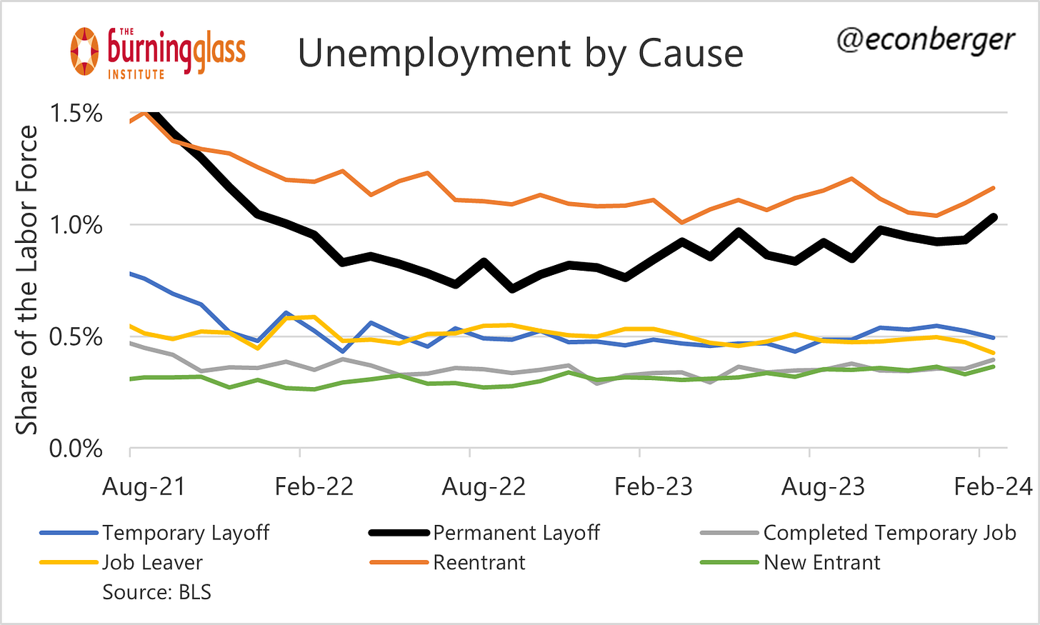
The increase was driven by a mix of good and bad short-term factors. (Though more broadly: over more than 2-3 months, increases in the unemployment rate are almost always bad.) On the bad side, the “permanently laid off” unemployment rate also rose to a 2-year high. On the good side, this was partly offset by an increase in new entrants and re-entrants to the workforce.
There’s also good news to be found in the Household Survey. Every data nerd’s favorite cyclical metric, the share of prime-working-age Americans with a job, rose to 80.7%, only 0.2 percentage points below its level in early summer (which was a 22 year high). It’s higher than at any point in the 2009-20 economic expansion.
If we’re talking prime working age labor force participation, that also rose (to 83.5%), matching the highest level since 2002.
It’s an odd mix of data. Nothing in here worries me too much but I wish it was consistently heading in the right direction.
3. Reconciling the 2 Surveys
Despite the title of this section, I’m not going to reconcile the massive gap between the household and establishment survey. But I will go through a series of thoughts.
The big gap is recent: between March and November of last year, the job counts for the establishment survey and the household survey were reasonably aligned. 1.8 million jobs added in the establishment survey, something like 1.6 million in the concept-adjusted establishment survey. Then all of a sudden in just 3 months they started telling very different stories: the establishment survey said employment increased by 800K, the household survey said employment fell by 1.25 million. I find it extremely implausible that the US labor market suddenly took a sharp turn for the worse in the last 3 months; a steady undercount would be much more plausible.
The household survey is very noisy: This cuts both ways. Maybe the recent swoon in the household survey is just noise and it will rebound to close the gap. Alternatively, we’ve been experiencing a consistent undercount (a la bullet 1) that was masked by household survey noise until the survey “corrected” in the last 3 months.
Forthcoming revisions will close the gap: Certainly possible. But why would a sudden overcount be almost entirely concentrated in the last 3 months? [Bullet 2 mitigates this?]
Multiple job holders: Already accounted for by the concept-adjusted establishment survey. (I’m not sure how well this metric adjusts for people holding more than 2 jobs, but this effect would be too small to matter.)
Undocumented workers: The argument here is that the establishment survey would measure more of these folks than the household survey. I suppose this is possible, but is it plausible? I’d think establishments reporting data to the government would be reluctant to count undocumented workers, but what do I know…
4. Wages and Hours
There was fortunately one section of the report that wasn’t confusing - in fact, as a relief, it de-confused a lot of January’s wacky data on hours and wage growth.
In January, we saw a big plunge in the workweek that may have been caused by bad weather. It fully reversed for non-managerial private sector workers, and partly reversed for all private sector workers:
We also saw a January spike in wage growth, caused by a combination of two factors - salaried workers working fewer hours (= higher hourly pay), and perhaps also lower-paid workers being more impacted (composition effect leading to higher average pay). In any event, that unwound in February.
Average hourly earnings have increased at about 4% on an annualized basis over the past 3 months. This is a growth rate that Fed Chair Powell has said is a little too high, but I wonder if he will re-evaluate given the recent surge in productivity growth. I don’t put a lot of weight on “wage growth causes inflation” arguments in the discourse, but if you do, today’s data assuages many of your worries.
For what it’s worth, I wonder if we’re near the end of the deceleration in nominal wage growth (barring a recession).


"Wage growth: 4.0% annualized over the past 3 months (a little above where the Fed wants it)"
It is not the Fed's job to want wages to grow faster or slower or not at all.
BTW, Neither the Fed nor anyone else know how fast wages grew because BLS does not produce any wage indexes.
BLS produces unit value indexes, but these are affected by composition of wages within a category as the report itself points out:
"We also saw a January spike in wage growth, caused by a combination of two factors - salaried workers working fewer hours (= higher hourly pay), and perhaps also lower-paid workers being more impacted (composition effect leading to higher average pay)." So why call it "wages?"