TL;DR: December’s jobs report was not bad on net, but nevertheless disappointing relative to last month’s “Goldilocks” sheen. Data from the household survey was weak, and wage growth heated up above where the Fed would like it.
Key data points:
Unemployment rate: unchanged at 3.7% (ok)
Prime working age employment population ratio: fell to 80.4% from 80.7% (bad)
Nonfarm payroll employment: rose by 216K (good)
Wage growth: 4.3-4.8% annualized over the past 3 months (not good, from the Fed’s perspective)
Below I’ll discuss:
The big picture
Key data and nuance
Miscellaneous data of interest
1. The Big Picture
The way I’m thinking about the labor market right now is “how close is our current trajectory to a soft landing of low inflation and low unemployment?”
And the answer, after Friday’s BLS report, is “we’re still close, but very slightly further away”. The labor market looked a tad less strong than a month ago, i.e. risking the “low unemployment” half of the soft landing; and wage growth looked hotter than a month ago, risking the “low inflation” half of the soft landing. Since I’m fond of the overused Goldilocks metaphor, some of the porridge she found last month has turned a little sour.
But it’s just one month and data are noisy, so the impact on your overall perspective should be small. *Conditional on soft landing as the most likely outcome*, the kind of predictably ordinary wiggles in the data we’ll see over the coming year are likely to trigger periodic anxiety about a “hard landing” (recession) or “no landing” (persistently elevated inflation). Maybe things will be less boring on a month-to-month basis than I predicted yesterday even if on a whole-year basis they’re still pretty dull and unremarkable.
Anyway, I gave you a long preamble on why this report wasn’t too my liking, but didn’t give any details. So here they are. There were 3 discordant threads in today’s report:
Solid job gains (establishment survey)
Hot wage growth (establishment survey)
Weak household survey
Solid job gains (establishment survey)
Let’s start with #1. The 216,000 gain in nonfarm employment is quite good. There were non-trivial revisions to the prior 2 months, but in the end if this is the only number you’re looking at, you’re probably feeling happy about labor market health.
Hot wage growth (establishment survey)
Onto #2. A few weeks go, Fed Chair Jay Powell said:
“Wages are still running a bit above what would be consistent with 2 percent inflation over a long period of time. They’ve been gradually cooling off. But if wages are running around 4 percent, that’s still a bit above, I would say.”
Well, in December’s data, average hourly earnings rose by over 4% on a 3 month annualized basis. I don’t expect this will persist (more later in this recap), and the links between wage growth and consumer price inflation are loose, but it moves us a tiny bit away from the “low inflation” half of a soft landing.
Weak household survey
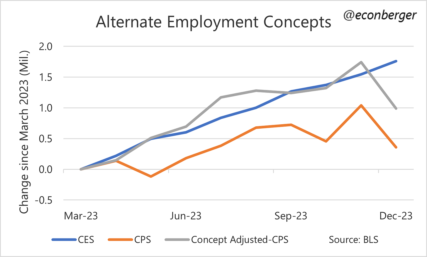
The household survey is where indicators like unemployment, labor force participation, and the employment/population ratio comes from. It and the establishment survey (where nonfarm payrolls and wage growth come from) contradict each other from time to time; December was one of those times.
We saw a big plunge in the household survey’s estimate of employment. This is an ultra-noisy survey, especially when talking about employment/unemployment counts (rather than ratios), so I wouldn’t put too much weight on one month’s disappointment. But…
…The softness in the household survey goes beyond just one month. In general most indicators derived from that survey have cooled since the spring/summer. Only by a little, mind you. And there’s some disagreement about whether that cooling has continued.
For example, the unemployment rate is up 0.3 percentage points since May. But it’s actually decreased a little bit since September. You could interpret this as “yeah, things have cooled a little, but the cooling is behind us.” A few other indicators like part-time-for-economic reasons employment and unemployment-due-to-permanent-layoff tell a similar tale.
Meanwhile, my beloved prime-working-age employment ratio is down 0.5 percent points since July. It deteriorated further in December. You could interpret this as “things have cooled a little, and that cooling is ongoing”.
The household survey is only half of the report and you shouldn’t discount the still-healthy establishment survey. And even the household survey is of mixed mind. But last month both these surveys moved in the same positive direction, and now they’re not. We’re nowhere near recession-level worries - not even close - but it should make you a little less cheery about the state of the labor market.
2. Key Data and Nuance
Nonfarm Payrolls
I’ve covered the big takeaway from this data up-post. The overall data remains cheery. If you’re a pessimist, you might argue that whereas before today it looked like around mid-year these gains had stabilized around 200,000 per month, we’re now on a very slight downward glide. But it’s going to take a very long time for that glide to turn worrisome.
Splitting the data by industry, the strongest gains were in health care & social assistance (+59K), government (+52K), professional & business services excluding temp agencies (+46K), and leisure & hospitality (+40K).
The only two industries to experience large job losses were temp agencies (-33K) and transportation & logistics (-23K).
Unemployment Rate
The unemployment rate was unchanged at 3.7%, and is a little below its level in late summer and early fall (3.8%). This happened because of a large decline in the workforce, so it’s not great news, but in my experience these kinds of contrarian explanations of the unemployment rate (“decline, but bad because people left the labor force” / “increase, but good because people entered the labor force”) tend to be ephemeral. Stretched across more than a few months, increases in the unemployment rate are bad and decreases are good, full stop.
Prime Working Age Employment Population Ratio
I’ve already shared this chart twice, will spare you a third appearance. But this indicator hit 80.9% (a post-2001 high) in late spring and early summer. It then began a downward glide. In December it fell to 80.4%, the lowest since January.
I’m hopeful this will turn around, despite the macro gods apparently punishing me for tweeting the following on Thursday:
Wage Growth
I discussed earlier how this challenges the soft landing trajectory a little, and also that I suspect the recent acceleration will prove ephemeral. Partly this is because other metrics, like quits and hires in the JOLTS report, are moderating. But it’s also because the data seems particularly vulnerable to revisions.
The BLS publishes response rates to the establishment survey, and those for December’s iteration were particularly abysmal - one of the 2 worst months of the past decade, along with November 2022.
The good news is the respondents have two more months to report data to the BLS, so we’ll have a more complete picture in early March. The bad news is that BLS’s establishment surveys were based on less-complete-than-usual data. And what happened last time this incompleteness was so severe, in November 2022?
Well, we got an initially reported big spike in wage growth…
…and then, the next month, as BLS got more complete data, that spike totally disappeared via revisions.
The other reason to expect a moderation is that we saw a decline in the average workweek in December. Average weekly earnings growth (average weekly earnings = average weekly hours * average hourly earnings) was actually fairly muted in December. As long as we don’t see a big rebound in weekly earnings or ongoing workweek declines, that bump in hourly wage growth won’t repeat.
I’m reasonably confident that we’re not on the cusp of a sustained reacceleration in wage growth.
3. Miscellaneous Data of Interest
Part Time for Economic Reasons: I mentioned that a lot of the household survey indicators suggested the labor market had cooled in the 2nd half of the year, but that cooling was in the rear view mirror. This metric - people who want to work full time hours, but can’t due to the state of the economy - hasn’t worsened in recent months.
The permanently laid off, and labor force re-entrants: The BLS splits up the unemployed by “cause”. The two largest categories are the “best” (people who re-enter the labor force to look for work) and the “worst” (people who lost their job due to permanent layoff). The former has declined in recent months, and is now the lowest in many months. But the latter, while higher than a year ago, has not really budged since March.
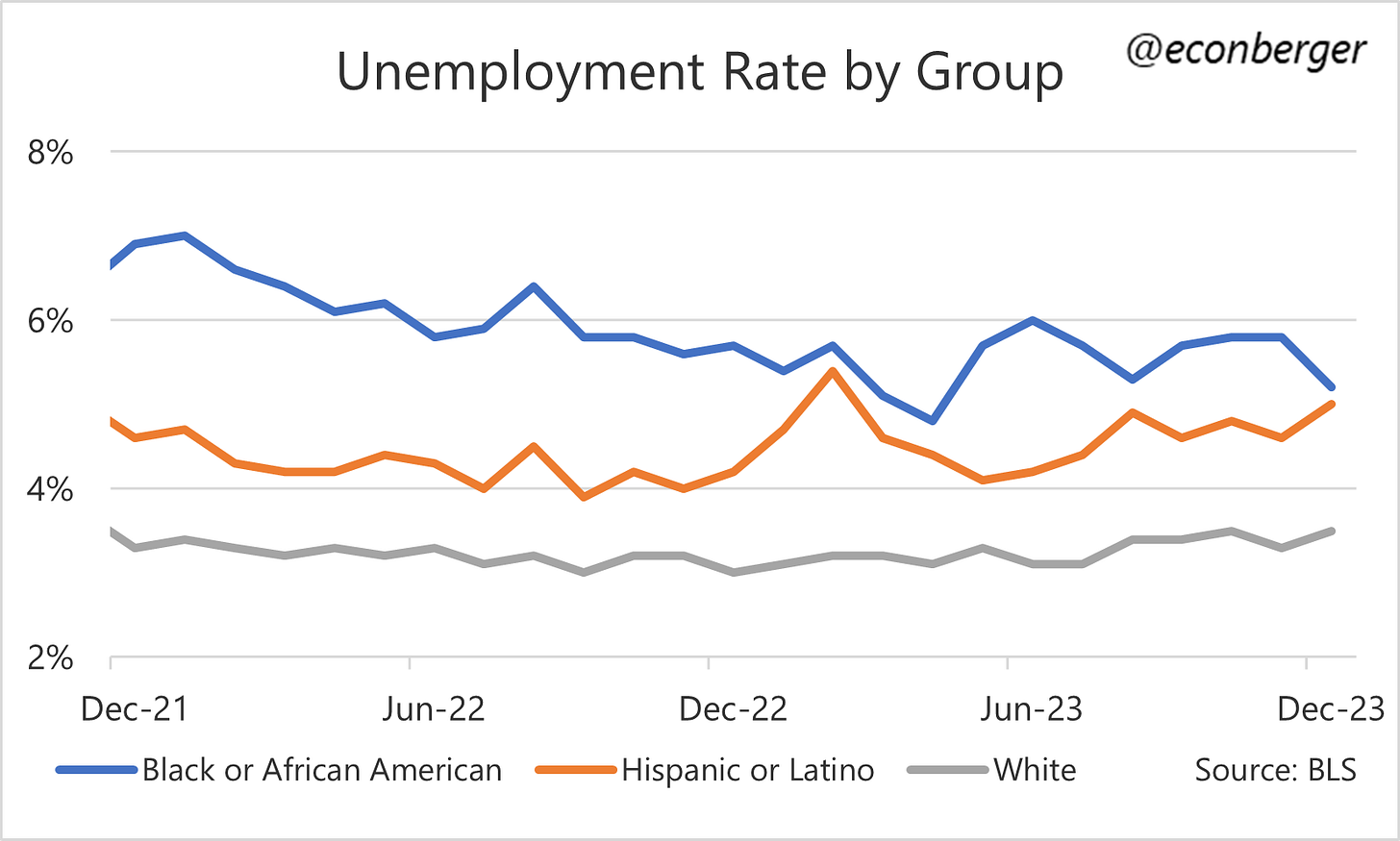
Unemployment Rate for Black and Hispanic Americans: Black Americans experienced a decline in unemployment (good) but Hispanic Americans experienced an increase (bad). Historically these workers have been particularly sensitive to downturns in the labor market.
Prime Working Age Labor Force Participation: This is mostly the same story as the prime working age employment/population ratio, with lower amplitude. It peaked a few months ago and has cooled a little since then. Moreover, the cooling is ongoing.
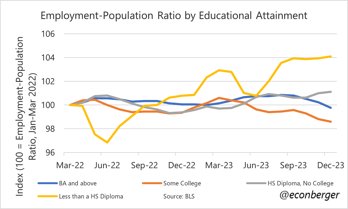
Employment by Educational Attainment: The mystery of weak employment among workers who have some college education but no BA continues to puzzle. The boom among workers who do not have a high school diploma continues to… boom.


