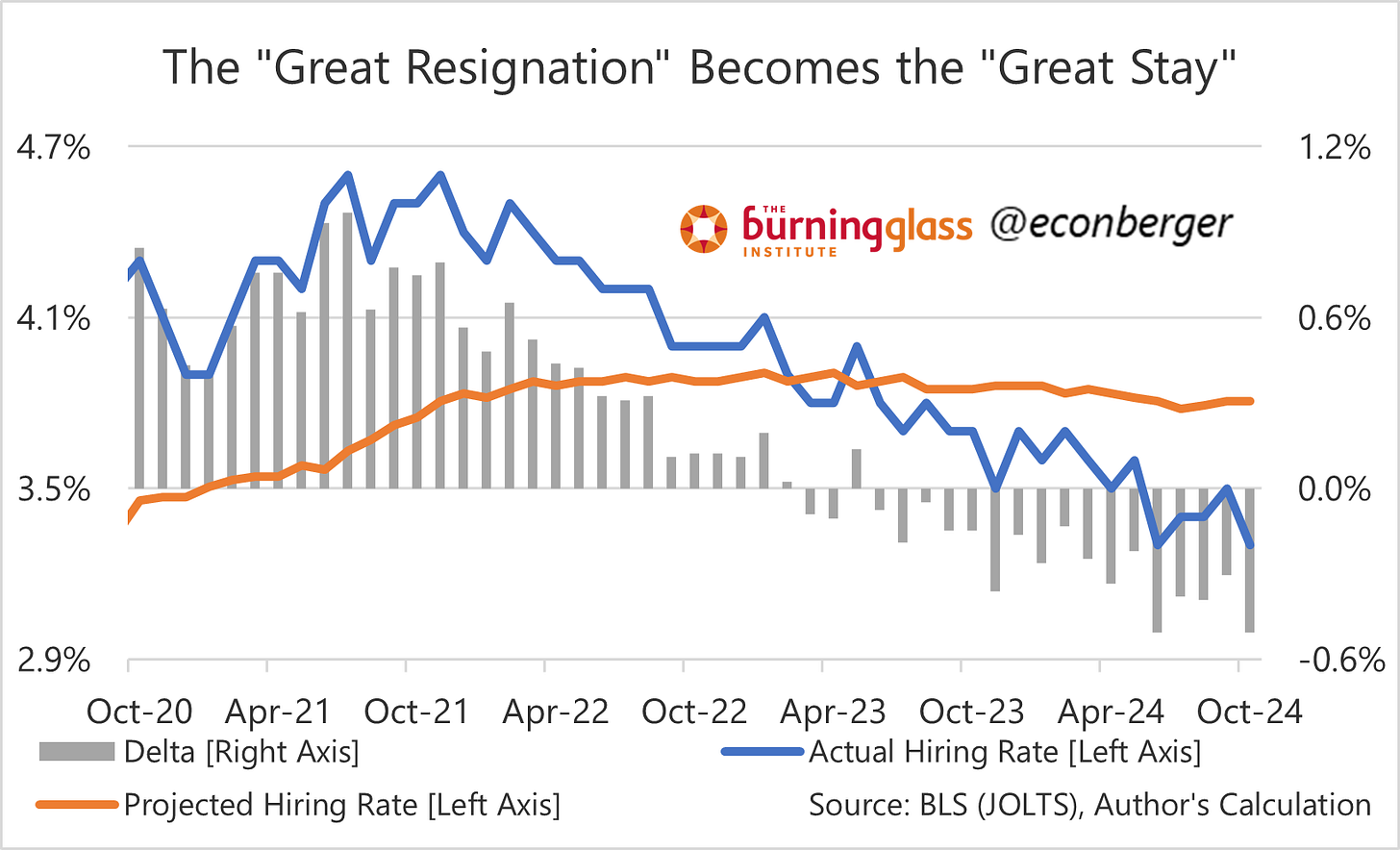
TL;DR: October’s JOLTS data was a mirror image of September’s: unusually weak hiring, but healthier quits and layoffs. Job openings, the least valuable portion of the report, rebounded from Hurricane Helene.
The rest of this post covers:
The Big Picture
The Beveridge Curve
The Post-Hurricane Rebound in Job Openings
More below chart.
1. The Big Picture
This is very good job market if you are happy with your job, a decent job market if you have a job but are interested in other opportunities, and a bad job market if you don’t have a job but are looking for one.
Let’s start with the bad news: hiring is low. The hiring rate of 3.3% is what we saw in the early 2010s with an unemployment slight above 8% (vs. the current 4.1%). It’s tough to find a job if you’re looking for one, and these jobseekers have borne the brunt of labor market cooling over the past three years.
If I can editorialize a little bit past JOLTS, this may also explain why we’re seeing a sharper deterioration in unemployment among college grads in their early 20s than among people with less educational attainment - labor market entry is being adversely impacted by weak hiring.
But it’s not all bad news. Employers may be resistant to hiring, but they’re also unusually averse to laying people off. The layoff rate fell back to 1.0%, matching a level lower than we ever saw pre-pandemic. Most people who have jobs - and there are a lot of them by historical standards, at least in the prime working age - have higher than normal job security.
In the middle between meager hiring and rare layoffs are quits - these rebounded in October. At a hiring rate of 2.1%, we’re comparable to where we were last cycle with an unemployment rate of 4.7% - in late 2016 or early 2017. That was not a great labor market, but it was certainly a good/decent one.
Which of these indicators is most representative of “what is really going on”? I’m not sure one indicator is ever sufficient to encapsulate everything, but am guessing that the median experience is probably close to the quit rate - things could be better, but they also could certainly be much, much worse.
2. The Beveridge Curve
The Beveridge Curve maps out the relationship between job openings and unemployment rate. During the spring and summer there was growing anxiety that we’d shifted to the shallow diagonal portion of the Curve (similar to the orange and dark blue dots) rather than the vertical portion (yellow dots). If so, that would mean that any additional labor market cooling could be fairly painful, with meaningful increases in unemployment.
But as we continue to swim around in the blob of light blue dots, the slope of the Curve remains near-vertical. There’s been a small increase in the unemployment rate over the past year and a very large decrease in job openings. At some point we’d probably risk “going orange” if the labor market kept on cooling, but I think there’s a decent chance that the cooling process is close-to-over.
3. Post-Hurricane Rebound in Openings
The South was the region of the United States most severely impacted by hurricanes in late September and mid-October. But the only portion of the report to clearly show a hurricane impact was Southern job openings, which plunged in September and rebounded completely in October.
The explanation: job openings are measured as of the last day of the month, whereas the other series (hiring, quits, layoffs and other separatoins) are tallied over the entire month. So a temporary impact from a hurricane hitting just at the right time (the end of the month) is likely to dent openings much more than any other indicator.


